Original Post
Replies sorted oldest to newest
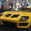
I guess people get bored and try to make cars look like lambos
I like it. fresh take.
The worst interior I've ever seen in a car - what the heck were they thinking?! Nicest Fiero instrument cluster I've seen, but different colors for each half of the interior?! I guess the brothers couldn't agree and each did half the interior.
I do like the wheels (Ford GT), the wheel arch flares look nice, and the rear end isn't too bad. But you can't improve upon perfection! IMO, they should have left Tom's original design alone.
http://blogs.hotrod.com/ringbr...3.html#axzz2jsfiFbNX


I do like the wheels (Ford GT), the wheel arch flares look nice, and the rear end isn't too bad. But you can't improve upon perfection! IMO, they should have left Tom's original design alone.
http://blogs.hotrod.com/ringbr...3.html#axzz2jsfiFbNX


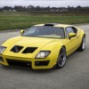
Ok, those outdoor shots show off the bodywork in a much better light. It's actually not that bad (I still prefer the original lines), and I'll concede that they succeeded in their own "interpretation" of a modern Pantera. But that home-made KIT CAR looking interior just ruins the whole thing!
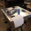
What is the thing in the back - an expresso machine???
There are elements I like about this build and some I don't. Looking at the front of the car, my eyes are immediately drawn to the hood vents. This element is so wrong to me that it pulls my attention away from what they did to the headlights. I can imagine the velocity of the incoming air at speed being drawn in fighting the the air being pulled by the fans.
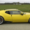
The side profile looks nice.
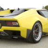
The back profile I like.
The interior is so so (designed by Nike).
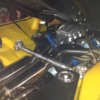
The car looks strictly for show. No provisions for wipers (must use rainX). That thing in the engine bay next to the espresso machine looks like a 5 gallon gas tank.
I want to see how it does in the Optima Challenge. Ring Brothers is usually invited to it.
Okay, off my high horse already.
that interior... is that just american MODERN style or a joke ???
PLEASE FORGIVE ME... it's ridiculous
PLEASE FORGIVE ME... it's ridiculous
I also like the side profile. Not keen on the hood vents. The rear lower valence reminds me little of the Pantera SI.
The one thing I did like about the interior - looks like tilt steering to me. (I would really like that option in my Pantera). The rest of the interior is definitely not my cup of tea.
Here is a link to a closer pic of the column. Pantera Column From the pic you can see two levers on the left side of the column - one blinker & one tilt I am guessing. Definitely looks like a tilt column to me.
My 2 cents........
I like the back and side treatments and of course the color, but the front and interior not so much..........
More photos and a short article here......
http://www.worldcarfans.com/21...ra-by-ringbrothers#9
I like the back and side treatments and of course the color, but the front and interior not so much..........
More photos and a short article here......
http://www.worldcarfans.com/21...ra-by-ringbrothers#9
Attachments
At least it has a tilt steering column! Us chubby guys should like that. You got to appreciate the workmanship?
what's with the license plate - did they "interpret" that too
the spreader bar looks like two spicer half shafts welded together - nice touch
the spreader bar looks like two spicer half shafts welded together - nice touch
Wheels look good. Hate the interior, but heck its a show car.
quote:what's with the license plate - did they "interpret" that too
I was going to ask the same thing… Looks beat up, like it was swiped from a wrecking yard! Kinda out of place on the car.
quote:quote:
what's with the license plate - did they "interpret" that too
I was going to ask the same thing… Looks beat up, like it was swiped from a wrecking yard! Kinda out of place on the car.
I believe they were going for the nostalgic aspect of the 42 year old car. So yes, the did indeed "interpret" that too. And the owner was very happy with the result.
quote:Originally posted by ZR1 Pantera: And the owner was very happy with the result.
So you are saying they did all this on someone else's coin? How much input did the owner have?
I must admit in initial photos I didn't like much of it all, but as I explore higher resolution photos I find there are many elements that are growing on me.
Julian
I think I would have to agree with everyone on the interior, I am not a big fan.
The exterior is pure art work. I think it is fantastic. The wheel archs and the intake for the brake ducts, perfect!
I like the rear, don't care much for the tail light lens design.
The nose is a bit lambo'ish but its growing on me.
I will be using this car as a guide for my fender flares for sure.
The exterior is pure art work. I think it is fantastic. The wheel archs and the intake for the brake ducts, perfect!
I like the rear, don't care much for the tail light lens design.
The nose is a bit lambo'ish but its growing on me.
I will be using this car as a guide for my fender flares for sure.
quote:So you are saying they did all this on someone else's coin? How much input did the owner have?
The story goes that the guy that owned the car always dreamed of doing a resto-mod on it but then he got sick and passed away. So the Widow decided to have the care completed in his honor.
Not sure how much money changed hands. I even heard one person say that it was done for free. I have no idea if that is true. I also heard that the Widow gave the Ring Brothers complete carte blanche to do the car as they saw fit.
I also heard Nike (yes, the shoe company) had some, if not all, the responsibility to do the interior. Don't know if that includes the design.
The Link below has an interview with the ring Bros and the background and story with the car.
Love it or hate it, it does provide background on how the build happened.
Some of the other interviews are interesting as well if you are up for the full length. Ring Bros is the first.
http://www.adamcarolla.com/Car...al-extended-episode/
Love it or hate it, it does provide background on how the build happened.
Some of the other interviews are interesting as well if you are up for the full length. Ring Bros is the first.
http://www.adamcarolla.com/Car...al-extended-episode/
I like it. That's the beauty of freedom of choice. I'm not doing that to mine. I like the nostalgia of the 1970s.
Like others, the side view is the best aspect of this build. Love the rear brake ducts and the sweep of the rockers that become the rear bumper. I even like the shape of the rear window even though it appears there is no glass and unfinished. I probably would have preferred an open grill treatment. Even the front end's shape is nice. Tail lights are probably the weakest and cheapest looking parts of the build. The interior is "gawd-awful." But, what is amazing is how contemporary a 44 year old design can look with really minor tweaks to the body. What a testament to the original design.
I do not like it . The Interior looks like a kit car ,and the holes in the hood look out of place
Just got home from SEMA, saw the car in person. I think the car is awesome overall with the exception being the interior (I don't know what they were thinking there!). Talked to one of the builders and this was a 350K build.....  I love the rockers and rear bumper/splitter and I like the tail lights as well. I really like the Ring Bros other builds also....I share the same tastes when it comes to resto-mods and I hope to incorporate some of the same styling into my build.
BTW I have lots of pics on my computer but it is difficult to post them on this forum.
I think the car looked much better in the photo's on the street outside. Double ditto on the interior, I would have stole from an early Italian car with rich leather. Good for the mark to see it out there, good luck to those guys....
quote:Originally posted by randy37:
Talked to one of the builders and this was a 350K build.....
That's a 250K wasted...
Rover, thanks for the links. Very interesting to hear the story from their mouths. They said that "we'd be surprised how little money was spent on this" so if the number Randy indicates ($350k) was really the number, then it seems like a lot.
Anyhow, overall the car is pretty darn nice. I'm impressed with the quality. So many details and so many great subtle improvements along with all those really big changes.
But even the weird interior has some very nice design features. The two colors takes away from it, as does the squarish, boxy, gauge cluster, but I'm impressed.
Randy, I'd love to see the pics you took. Can you send them by email? Thanks.
dberman@canspan.com
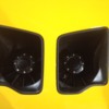
I a guessing the right rear black box is the gas tank, any idea what is the left rear black box?
I have to agree with David Berman's comments. I understand both Mother's and Motor Trend named the RB Pantera the best car at SEMA. That's pretty high praise considering there were approximately 1,500 custom cars there. The automotive web site Jalopnik wrote about the RB Pantera: "If this isn't awesome I don't know what is".
As far as the black box in the right rear of the engine compartment is concerned, I don't think it's the fuel tank. Quite some time ago, Ring Brothers posted a photo of the Pantera's fuel tank on their web site. It was clearly designed to be mounted in the front trunk.
As far as the black box in the right rear of the engine compartment is concerned, I don't think it's the fuel tank. Quite some time ago, Ring Brothers posted a photo of the Pantera's fuel tank on their web site. It was clearly designed to be mounted in the front trunk.
Attachments
the quality of the work is not really arguable, the vision well that's a different subject. I like some aspects of the design, others just seem less functional in an attempt to modernize the look. To me a few of the views of the car remind me very much of a Factory Five GTM. Personally I feel a lot of the Pantera's unique cues were lost and seems like the Pantera was more of just a simple platform donor. A rebodied GTM probably wouldn't get the same praise 
quote:Originally posted by David B:
Rover, thanks for the links. Very interesting to hear the story from their mouths. They said that "we'd be surprised how little money was spent on this" so if the number Randy indicates ($350k) was really the number, then it seems like a lot.
Anyhow, overall the car is pretty darn nice. I'm impressed with the quality. So many details and so many great subtle improvements along with all those really big changes.
But even the weird interior has some very nice design features. The two colors takes away from it, as does the squarish, boxy, gauge cluster, but I'm impressed.
Randy, I'd love to see the pics you took. Can you send them by email? Thanks.
dberman@canspan.com
E-mail sent David
quote:Originally posted by Denis C:
I a guessing the right rear black box is the gas tank, any idea what is the left rear black box?
The box on the right is a little storage area and the one on the left is a jack w/ removable pads that attach to the bottom of the car.
I remember a quote from Tom Tjaaarda about Panteras without the bottom rockers blacked out - looking like a "fat cat with it's belly dragging on the ground"....
I like the car overall, especially the side view, but I think it would look a little better with a black treatment on the rockers.....
I also think an espresso machine would be cooler than the Jack and removalble pads... (if you have 350K for a car, why not have an expresso while you are waiting for a flatbed to pick you up in case of a flat tire?)
Rocky
The spreader bar looks cool. Everything else is better in Tom´s design.
Add Reply
Sign In To Reply


