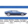
As some of you hopefully know, POCA is redesigning its web site. Content is easy to spec out for the website but coming up with a Title/Header for the site takes some creativity. How do we capture the essence of the car in the header for the web site?
So, here's the request. Got any ideas what we might do? The picture below is what we have been using just to hold the space at the top of the screen. The main requirements for the header are that it be thin so it doesn't take up too much screen space, be quick to load which means it can't be animated, it must have a line across the bottom so that we can put the menu under it horizontally, and it must identify POCA.
Looking forward to hearing from you.
Jeff
6559
jjd1010@aol.com
Attachments
Original Post


